CASE STUDY > 100 THUMBNAILS

Team
Me
Adam Wickens
My Role
Thumbnail strategy & design, testing, and creative direction
Duration
2024 - present
CONTEXT
Make it Clickbaity…
For the past year, I’ve been consistently designing YouTube thumbnails that drive clicks and engagement—partnering with Adam Wickens, a Canadian reptile educator with 390k+ subscribers, while also shaping the visual identity of CallHub’s growing YouTube presence.
140+
Thumbnails Made
6.2%
Highest CTR
3M+
Views total
KEY LEARNINGS
#1 The Curiosity Gap
Unlike reels or short-form content, long-form video requires an active decision from the user to click. You don’t need MrBeast’s budget to earn that click, you need controlled tension.
Patterns I use:
Make one clear promise, hide one piece of information (curiosity gap).
Show dominant subject (face, or in this case, reptile) with extreme scale.
Keep a three-value palette (dark / mid / accent) for instant read at small sizes.
Designing the Thumbnail
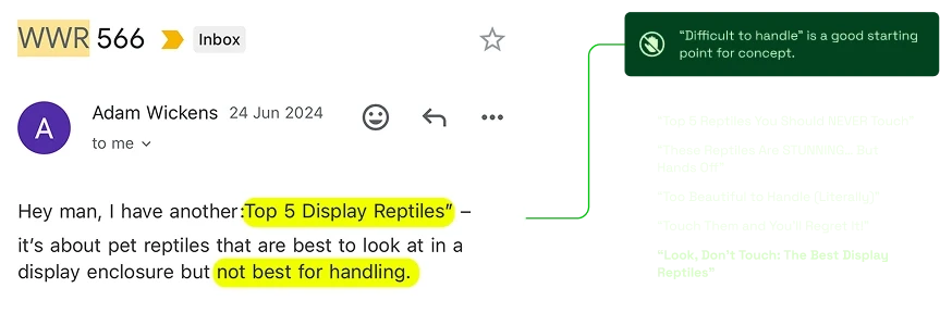
I exaggerated the hazard (radioactive tint + stronger rim light) so the “look vs. touch” tension is legible in 0.5s. The reptile became the centerpiece, and all other elements subordinate to that read. This also worked for the reptile-breeder niche, as the reptile tends to be the main focus of this genre of videos.

CONCEPT SKETCH TO FINAL THUMBNAIL
" width="18.999999744654872px"><path d="M 4.02 0 L 4.02 0.956 L 6.03 0.956 L 6.03 1.906 L 4.02 1.906 L 4.02 11.431 L 5.022 11.431 L 5.022 12.381 L 4.02 12.381 L 4.02 13.337 L 0 13.337 L 0 0 Z" fill="rgb(250, 230, 238)" height="13.337499267394621px" id="VV35zZ4xC" transform="translate(0 0.938)" width="6.0301768889532354px"/><path d="M 0 13.331 L 2.01 13.331 L 2.01 14.287 L 0 14.287 Z M 1.008 0.95 L 2.01 0.95 L 2.01 1.906 L 1.008 1.906 Z M 2.01 14.287 L 3.012 14.287 L 3.012 15.237 L 2.01 15.237 Z M 3.012 15.237 L 4.02 15.237 L 4.02 19.05 L 3.012 19.05 Z M 4.02 19.05 L 6.024 19.05 L 6.024 20 L 4.02 20 Z M 5.022 12.381 L 6.024 12.381 L 6.024 13.331 L 5.022 13.331 Z M 6.024 18.094 L 7.032 18.094 L 7.032 19.05 L 6.024 19.05 Z M 6.024 13.331 L 7.032 13.331 L 7.032 14.287 L 6.024 14.287 Z M 6.024 11.431 L 12.054 11.431 L 12.054 12.381 L 6.024 12.381 Z M 7.032 14.287 L 8.034 14.287 L 8.034 18.094 L 7.032 18.094 Z M 2.01 0 L 11.045 0 L 11.045 0.95 L 2.01 0.95 Z M 8.034 3.812 L 8.034 2.856 L 12.054 2.856 L 12.054 1.906 L 13.055 1.906 L 13.055 3.812 Z M 11.045 0.95 L 12.054 0.95 L 12.054 1.906 L 11.045 1.906 Z M 12.054 10.475 L 13.055 10.475 L 13.055 11.431 L 12.054 11.431 Z M 9.042 9.525 L 9.042 8.569 L 13.055 8.569 L 13.055 6.669 L 9.042 6.669 L 9.042 5.712 L 13.055 5.712 L 13.055 3.812 L 14.057 3.812 L 14.057 10.475 L 13.055 10.475 L 13.055 9.525 Z" fill="rgb(250, 230, 238)" height="19.99999918423988px" id="MMpVq5gIb" transform="translate(4.943 0)" width="14.057231480955778px"/></g></svg>)
Designer Bias Detected
My first pass leaned on iconography that felt “obvious” to me; but it didn’t register for a younger US audience.
The fix: remove abstract icons, push the subject larger, and clarify the physical gesture. Audience over designer cleverness.

FINAL 2 VERSIONS
#2 Testing Thumbnails in real-time
Let’s take a look at another channel, CallHub. We will be studying the video "2024, Explained". It went on to become the channel’s best performing video (340,000+ views), but for the first two days, it barely cracked 200 views.
We knew topic demand was broad, and the video itself was sticky; so it was the packaging (thumbnail + title) that wasn’t earning the click. We just needed the right audience to see it for the algorithm to notice and start pushing it.
Here's what I did to revive the video and make it go viral.

TRYING OUT COMPOSITIONS TILL IT FEELS RIGHT
Something’s not quite right...
The video was doing worse than previous videos. The complete opposite of what I assumed would happen.
Something had to be done...


VERSION 2: ADDING MORE PEOPLE AND INVERTING THE COLORS


VERSION 3: FINE-TUNING
" width="17px"><path d="M 6.06 6 L 5.046 6 L 5.046 6.998 L 6.06 6.998 Z M 4.04 18.011 L 4.04 8.003 L 5.046 8.003 L 5.046 6.998 L 4.04 6.998 L 4.04 5.997 L 0 5.997 L 0 20 L 4.04 20 L 4.04 19.002 L 6.063 19.002 L 6.063 18.011 Z M 3.026 10.002 L 2.023 10.002 L 2.023 8.006 L 3.03 8.006 Z M 7.066 5.002 L 6.06 5.002 L 6.06 6 L 7.066 6 Z M 8.073 0.998 L 7.066 0.998 L 7.066 5.002 L 8.073 5.002 Z M 9.086 8.003 L 8.073 8.003 L 8.073 9 L 9.086 9 Z M 10.093 0 L 8.073 0 L 8.073 0.998 L 10.093 0.998 Z M 10.093 6.998 L 9.086 6.998 L 9.086 8.003 L 10.093 8.003 Z M 10.093 11.003 L 9.086 11.003 L 9.086 13.005 L 10.093 13.005 Z M 10.093 14.003 L 9.086 14.003 L 9.086 16.005 L 10.093 16.005 Z M 11.099 0.998 L 10.093 0.998 L 10.093 1.996 L 11.099 1.996 Z M 11.099 6 L 10.093 6 L 10.093 6.998 L 11.099 6.998 Z" fill="rgb(216, 251, 202)" height="20px" id="S62lCeYGd" width="11.09933681740182px"/><path d="M 6.053 0 L 5.04 0 L 5.04 4.005 L 6.053 4.005 Z M 10.086 5.002 L 5.04 5.002 L 5.04 6.007 L 10.086 6.007 Z M 6.053 16.012 L 5.04 16.012 L 5.04 17.01 L 0 17.01 L 0 18.008 L 8.073 18.008 L 8.073 17.01 L 6.053 17.01 Z M 4.033 14.01 L 4.033 16.012 L 5.04 16.012 L 5.04 15.007 L 9.079 15.007 L 9.079 16.012 L 10.086 16.012 L 10.086 14.01 Z M 9.079 16.012 L 8.073 16.012 L 8.073 17.01 L 9.079 17.01 Z" fill="rgb(216, 251, 202)" height="18.00754688891079px" id="NK6UfUjN4" transform="translate(5.96 1.969)" width="10.086092740913045px"/><path d="M 6.053 1.996 L 1.007 1.996 L 1.007 0 L 0 0 L 0 3 L 6.053 3 L 6.053 5.002 L 0 5.002 L 0 6 L 6.053 6 L 6.053 8.003 L 7.066 8.003 L 7.066 0 L 6.053 0 Z" fill="rgb(216, 251, 202)" height="8.002625841984978px" id="AYI01P8bn" transform="translate(9.934 7.878)" width="7.066225051879883px"/></g></svg>)
#3 People hate AI (so be sneaky)
This one hurt...
I had used a fully AI creature image for one of my early thumbnails. The topic of the video was an obscure dinosaur species, and I was unable to find a hi-res image of it. So, I resorted to using an AI generated image of one. However, I was not aware of the strong anti-AI sentiment that our audience had, and hence once they caught on, they immediately flagged it and trust dipped… Lesson learnt.

USING AI BACKFIRES
Version 2: AI with finesse
That hurted. But I learnded.
But this was a year ago, and AI has gotten REALLY REALLY GOOD SINCE THEN. In fact, you’d be surprised at how much of the content you consume is actually AI generated. So, I decided to take a second-go at it, but this time, with more care.

VERSION 2: “BRINGING BACK EXTINCT ANIMALS”
Closing Notes: Why this matters beyond thumbnails
Thumbnails are micro landing pages: one promise, one action, one metric. Running 100+ of them sharpened my instincts for message–market fit, visual hierarchy, and rapid experimentation, skills that I apply directly to my day job as a visual designer. Thumbnail design may not be directly related to UI/Product Design, but the repetition and instant feedback nature of them make them great testing grounds for design ideas. As designers, we often work hard to show our business value (and rightly so). But sometimes, trying something completely different is just as valuable. Instead of relying on pre-defined Figma components, thumbnails force you to go back to the basic fundementals of design: Composition, color and story. As such, my learnings from making thumbnails have led to me to become a better designer overall.
My thumbnail playbook
Before Design:
One-line promise (≤6 words).
What am I hiding to create the gap?
What should the viewer feel in 0.5s?
Design rules:
One focal point, extreme scale.
Eye/hand lines point to the subject.
Three-value palette; avoid mid-tone soup.
Test at 160px and in greyscale.
Title lock-up and subject never fight.
Live Testing:
Ship 2–3 variants with explicit hypotheses.
Rotate for 24–36h; log CTR + impressions and save screenshots (YouTube’s context shifts).
System assets
Reusable LUTs, copy blocks, safe margins, and a naming convention so the team can move fast without drift.
" width="18px"><path d="M 0 0 L 18 0 L 18 18.508 L 0 18.508 Z" fill="transparent" height="18.508371353149414px" id="t_KMrow6V" transform="translate(0 0.492)" width="18px"/><path d="M 17.145 9.694 L 9.433 9.694 L 9.433 8.815 L 8.573 8.815 L 8.573 7.051 L 7.718 7.051 L 7.718 5.286 L 6.857 5.286 L 6.857 3.528 L 6.002 3.528 L 6.002 2.643 L 13.714 2.643 L 13.714 1.764 L 4.286 1.764 L 4.286 2.643 L 3.431 2.643 L 3.431 0.879 L 4.286 0.879 L 4.286 0 L 0 0 L 0 0.879 L 0.861 0.879 L 0.861 8.815 L 0 8.815 L 0 10.579 L 0.861 10.579 L 0.861 15.865 L 17.145 15.865 L 17.145 10.579 L 18 10.579 L 18 8.815 L 17.145 8.815 Z M 1.716 0.879 L 2.571 0.879 L 2.571 5.286 L 1.716 5.286 Z M 7.717 14.986 L 6.857 14.986 L 6.857 10.579 L 6.002 10.579 L 6.002 14.986 L 3.431 14.986 L 3.431 13.222 L 4.286 13.222 L 4.286 12.337 L 3.431 12.337 L 3.431 10.579 L 2.571 10.579 L 2.571 14.986 L 1.716 14.986 L 1.716 8.815 L 2.571 8.815 L 2.571 7.051 L 3.431 7.051 L 3.431 5.286 L 4.286 5.286 L 4.286 4.407 L 5.147 4.407 L 5.147 5.286 L 6.002 5.286 L 6.002 7.051 L 6.857 7.051 L 6.857 8.815 L 7.717 8.815 Z M 16.29 14.986 L 8.572 14.986 L 8.572 10.579 L 16.29 10.579 Z" fill="rgb(255, 255, 255)" height="15.865144585136845px" id="SvCrRGLSr" transform="translate(0 2.643)" width="18px"/><path d="M 15.429 9.694 L 14.574 9.694 L 14.574 11.458 L 15.429 11.458 Z M 14.574 7.93 L 13.714 7.93 L 13.714 9.694 L 14.574 9.694 Z M 13.714 6.171 L 12.859 6.171 L 12.859 7.93 L 13.714 7.93 Z M 13.714 14.101 L 11.143 14.101 L 11.143 16.744 L 13.714 16.744 Z M 12.859 15.865 L 11.998 15.865 L 11.998 14.98 L 12.859 14.98 Z M 12.859 5.286 L 11.998 5.286 L 11.998 6.171 L 12.859 6.171 Z M 9.428 10.573 L 9.428 11.458 L 12.859 11.458 L 12.859 9.694 L 11.998 9.694 L 11.998 10.573 Z M 11.998 8.815 L 11.143 8.815 L 11.143 9.694 L 11.998 9.694 Z M 10.288 14.101 L 7.717 14.101 L 7.717 16.744 L 10.288 16.744 Z M 9.427 15.865 L 8.572 15.865 L 8.572 14.98 L 9.427 14.98 Z M 9.427 9.694 L 8.572 9.694 L 8.572 10.573 L 9.427 10.573 Z M 8.572 8.815 L 11.143 8.815 L 11.143 7.93 L 7.717 7.93 L 7.717 9.694 L 8.572 9.694 Z M 4.286 12.337 L 1.716 12.337 L 1.716 13.222 L 4.286 13.222 Z M 2.571 0 L 1.716 0 L 1.716 0.879 L 2.571 0.879 Z M 0.855 0.879 L 0 0.879 L 0 1.764 L 0.855 1.764 Z" fill="rgb(255, 255, 255)" height="16.744291468520707px" id="UlLD2r9lv" transform="translate(1.716 0)" width="15.429375152587909px"/></g></svg>)
" width="20px"/><path d="M 0 0.925 L 15.238 0.925 L 15.238 1.857 L 0.956 1.857 L 0.956 2.782 L 15.238 2.782 L 15.238 3.714 L 0 3.714 L 0 4.639 L 0.956 4.639 L 0.956 18.557 L 0 18.557 L 0 19.482 L 16.194 19.482 L 16.194 18.557 L 1.906 18.557 L 1.906 4.639 L 16.194 4.639 L 16.194 18.557 L 17.144 18.557 L 17.144 3.714 L 16.194 3.714 L 16.194 0.925 L 17.144 0.925 L 17.144 0 L 0 0 Z" fill="rgb(255, 255, 255)" height="19.48249618592969px" id="aYnjfxyGC" transform="translate(2.381 0)" width="17.143749999999983px"/><path d="M 9.525 8.347 L 8.569 8.347 L 8.569 9.279 L 9.525 9.279 Z M 9.525 0.925 L 8.569 0.925 L 8.569 0 L 1.906 0 L 1.906 0.925 L 0.95 0.925 L 0.95 1.857 L 0 1.857 L 0 8.347 L 0.95 8.347 L 0.95 4.639 L 1.906 4.639 L 1.906 3.708 L 2.856 3.708 L 2.856 2.782 L 7.619 2.782 L 7.619 3.708 L 8.569 3.708 L 8.569 4.639 L 9.525 4.639 L 9.525 8.347 L 10.475 8.347 L 10.475 1.857 L 9.525 1.857 Z M 8.569 9.279 L 1.906 9.279 L 1.906 10.204 L 8.569 10.204 Z" fill="rgb(255, 255, 255)" height="10.20395737700772px" id="ZJrCHLD8K" transform="translate(6.194 6.496)" width="10.475000000000023px"/><path d="M 13.337 12.061 L 12.381 12.061 L 12.381 12.992 L 13.337 12.992 Z M 13.337 10.21 L 12.381 10.21 L 12.381 11.135 L 13.337 11.135 Z M 12.381 12.992 L 9.525 12.992 L 9.525 13.918 L 12.381 13.918 Z M 9.525 12.061 L 8.575 12.061 L 8.575 12.992 L 9.525 12.992 Z M 9.525 10.21 L 8.575 10.21 L 8.575 11.135 L 9.525 11.135 Z M 7.625 13.918 L 6.669 13.918 L 6.669 14.849 L 7.625 14.849 Z M 1.906 16.7 L 0.956 16.7 L 0.956 17.632 L 1.906 17.632 Z M 1.906 0 L 0.956 0 L 0.956 0.932 L 1.906 0.932 Z M 0.956 2.788 L 1.906 2.788 L 1.906 1.857 L 0.956 1.857 L 0.956 0.932 L 0 0.932 L 0 16.7 L 0.956 16.7 Z" fill="rgb(255, 255, 255)" height="17.63165829212045px" id="upC3wutIc" transform="translate(0.475 0.925)" width="13.337499427795422px"/></g></svg>)
" width="20px"/><path d="M 18.094 6.49 L 17.144 6.49 L 17.144 7.422 L 18.094 7.422 L 18.094 15.769 L 19.05 15.769 L 19.05 5.565 L 18.094 5.565 Z M 18.094 4.639 L 17.144 4.639 L 17.144 5.565 L 18.094 5.565 Z M 16.194 16.7 L 1.906 16.7 L 1.906 15.769 L 0 15.769 L 0 16.7 L 0.956 16.7 L 0.956 17.626 L 17.144 17.626 L 17.144 16.7 L 18.094 16.7 L 18.094 15.769 L 16.194 15.769 Z M 17.144 3.708 L 16.194 3.708 L 16.194 4.639 L 17.144 4.639 Z M 16.194 14.843 L 15.237 14.843 L 15.237 15.769 L 16.194 15.769 Z M 0.956 7.422 L 0.956 8.347 L 2.856 8.347 L 2.856 9.279 L 4.763 9.279 L 4.763 10.204 L 6.669 10.204 L 6.669 11.129 L 11.431 11.129 L 11.431 10.204 L 13.331 10.204 L 13.331 9.279 L 15.238 9.279 L 15.238 8.347 L 17.144 8.347 L 17.144 7.422 Z M 16.194 2.782 L 15.237 2.782 L 15.237 3.708 L 16.194 3.708 Z M 15.238 13.912 L 14.288 13.912 L 14.288 14.843 L 15.238 14.843 Z M 15.238 1.857 L 14.288 1.857 L 14.288 2.782 L 15.238 2.782 Z M 14.288 12.986 L 13.331 12.986 L 13.331 13.912 L 14.288 13.912 Z M 14.288 0.925 L 13.331 0.925 L 13.331 1.857 L 14.288 1.857 Z M 13.331 12.061 L 12.381 12.061 L 12.381 12.986 L 13.331 12.986 Z M 13.331 0 L 12.381 0 L 12.381 0.925 L 13.331 0.925 Z" fill="rgb(255, 255, 255)" height="17.625570882595515px" id="fm74dp3CZ" transform="translate(0.95 1.857)" width="19.049998581409483px"/><path d="M 13.331 12.986 L 12.381 12.986 L 12.381 13.918 L 13.331 13.918 Z M 13.331 0.925 L 12.381 0.925 L 12.381 1.857 L 13.331 1.857 Z M 12.381 0 L 7.619 0 L 7.619 0.925 L 12.381 0.925 Z M 7.619 12.986 L 6.662 12.986 L 6.662 13.918 L 7.619 13.918 Z M 7.619 0.925 L 6.662 0.925 L 6.662 1.857 L 7.619 1.857 Z M 6.663 13.918 L 5.713 13.918 L 5.713 14.843 L 6.663 14.843 Z M 6.663 1.857 L 5.713 1.857 L 5.713 2.782 L 6.663 2.782 Z M 5.713 14.843 L 4.763 14.843 L 4.763 15.769 L 5.713 15.769 Z M 5.713 2.782 L 4.763 2.782 L 4.763 3.714 L 5.713 3.714 Z M 4.763 15.769 L 3.806 15.769 L 3.806 16.7 L 4.763 16.7 Z M 4.763 3.714 L 3.806 3.714 L 3.806 4.639 L 4.763 4.639 Z M 3.806 16.7 L 2.856 16.7 L 2.856 17.626 L 3.806 17.626 Z M 3.806 4.639 L 2.856 4.639 L 2.856 5.565 L 3.806 5.565 Z M 2.856 5.565 L 1.906 5.565 L 1.906 6.496 L 2.856 6.496 Z M 1.906 6.496 L 0.95 6.496 L 0.95 7.422 L 1.906 7.422 Z M 0.95 9.279 L 1.906 9.279 L 1.906 8.347 L 0.95 8.347 L 0.95 7.422 L 0 7.422 L 0 17.626 L 0.95 17.626 Z" fill="rgb(255, 255, 255)" height="17.625570965738298px" id="WeoDDmc_O" transform="translate(0 0)" width="13.331249427795399px"/></g></svg>)